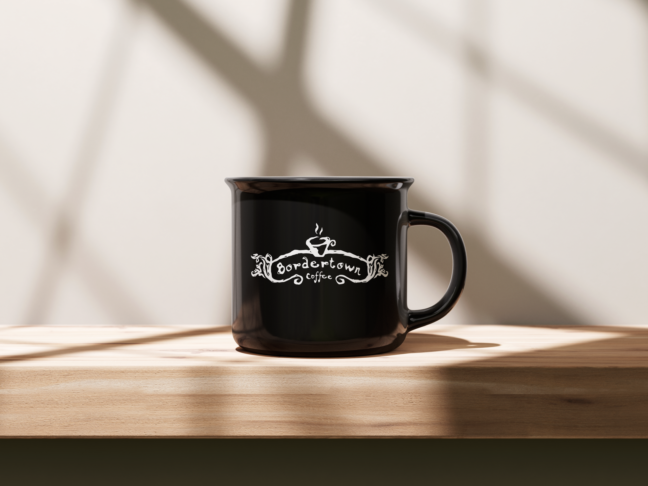
Bordertown Coffee
Bordertown Coffee is a popular coffee shop located in Minneapolis, Minnesota, near the University of Minnesota campus. It is known for its cozy, community-focused atmosphere, making it a favorite spot for students, faculty, and locals to gather, study, and enjoy quality coffee and pastries.
The shop is housed in a historic, charming building, and its ambiance reflects a mix of vintage and welcoming vibes. Bordertown Coffee is celebrated for its strong espresso drinks, homemade baked goods, and affordable prices. The shop often draws visitors not just for its menu but also for its laid-back, inviting space.
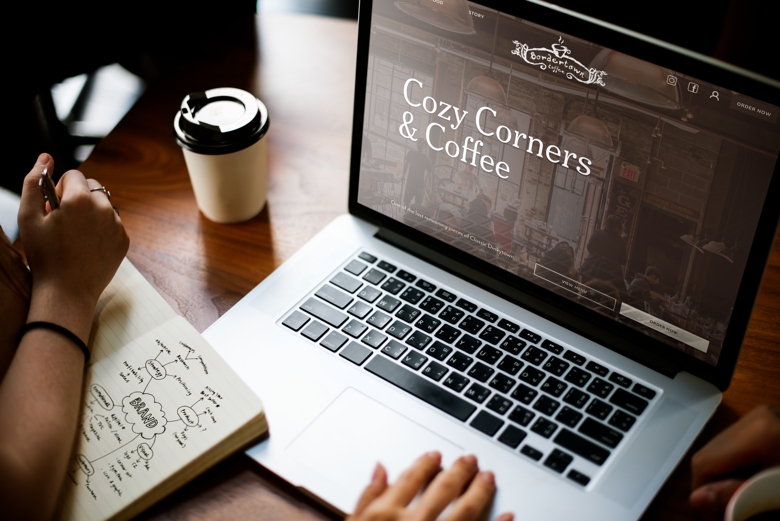
For this case study, my team members and I took on the task of analyzing and improving the website navigation of Bordertown Coffee. Our focus for this business was to create an accessible digital experience for its customers through a website redesign.
Duration: 10 weeks
Team members: Martha Vaughan, Kaci Kopf, Emily Ulfig
Role & Responsibilities: UX Design & UI Design
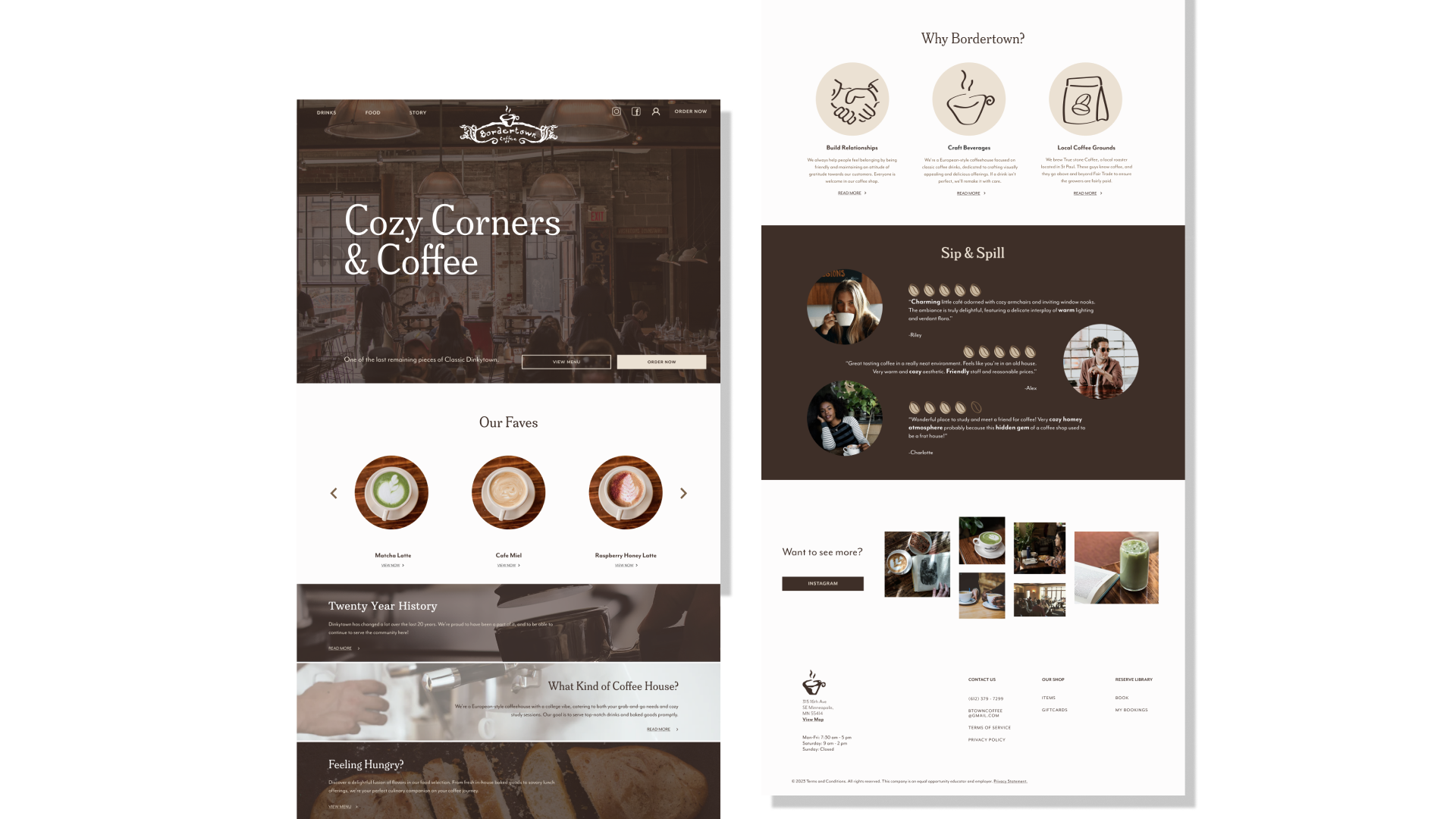
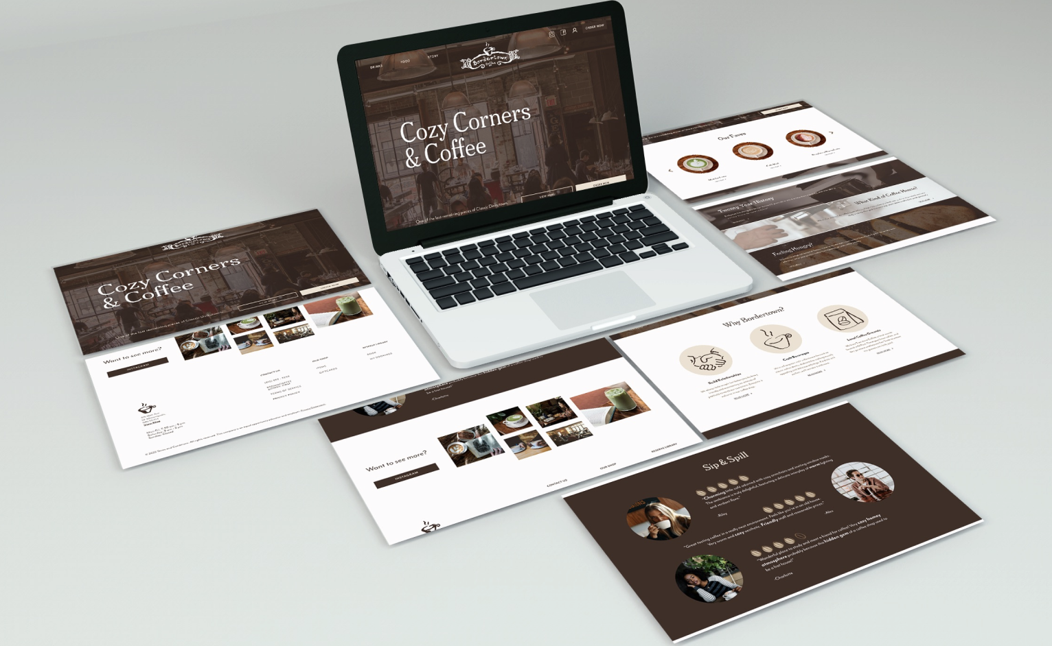
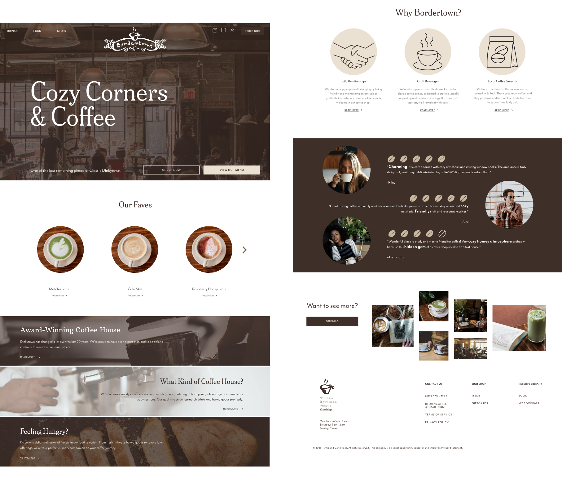
Final Homepage Walk through
DESIGN PROCESS
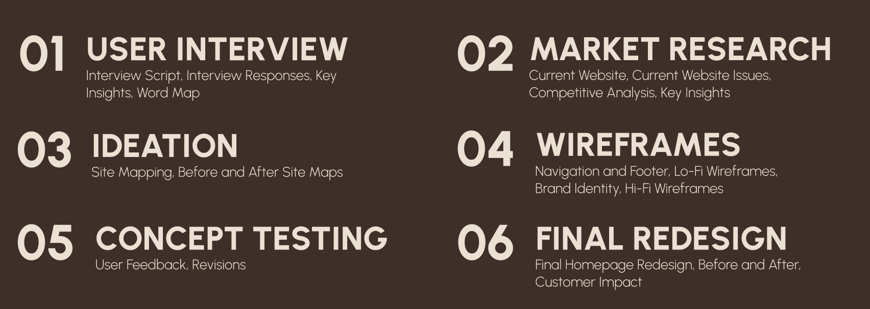
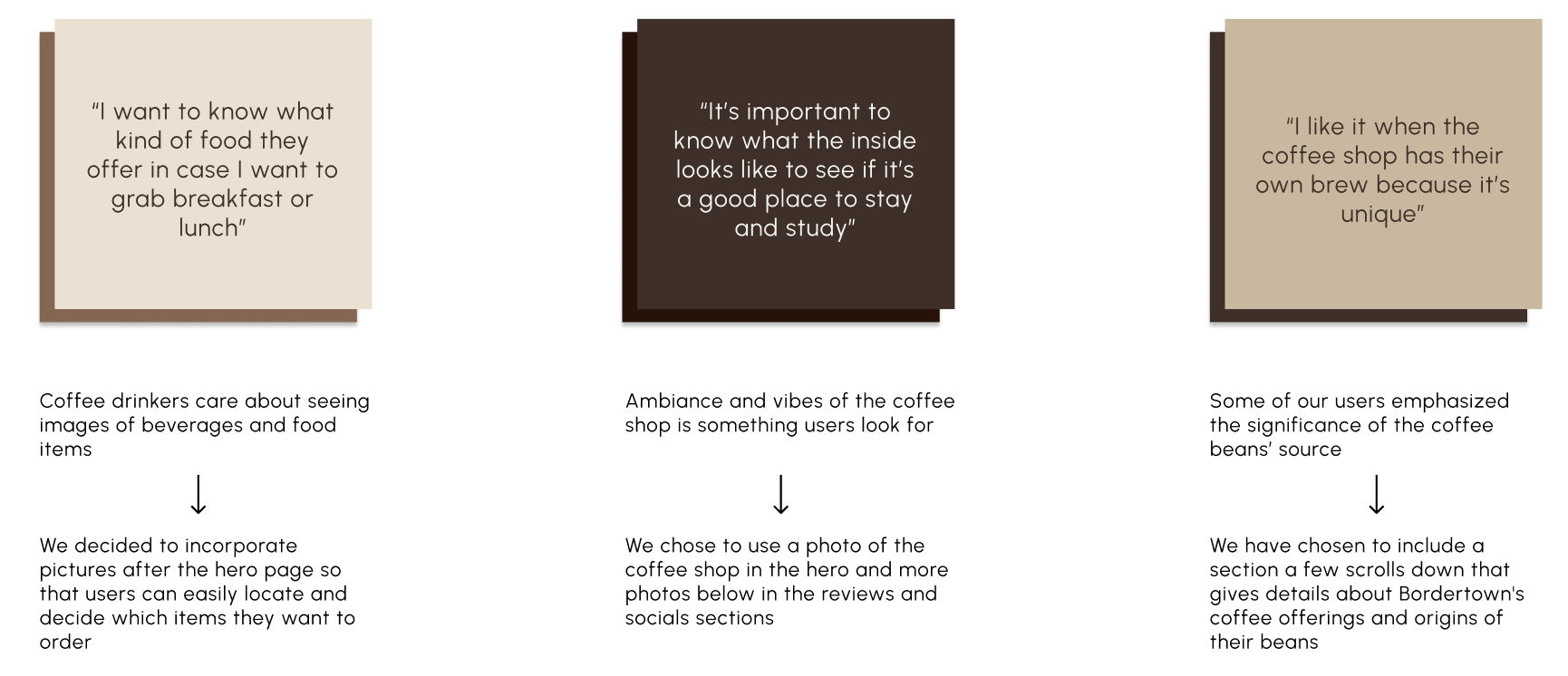
1. USER INTERVIEW
User Interview
To study our audience, we conducted a user interview with multiple participants. Participants were asked a series of questions aligning with their background on coffee and coffee shops. Highlighted in the right graphic are key insights from our users and their responses.
Questions asked covered the following topics:
Introduction of user (name, age, etc.)
User background (related to coffee shops & how much they drink)
Online ordering
Needs & pain points
2. MARKET RESEARCH
Market Research
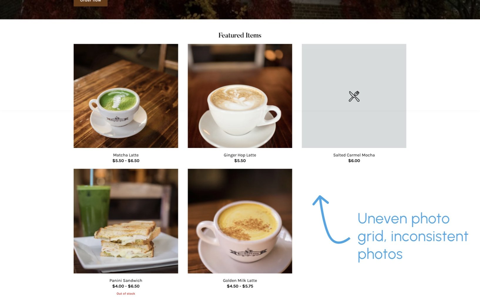
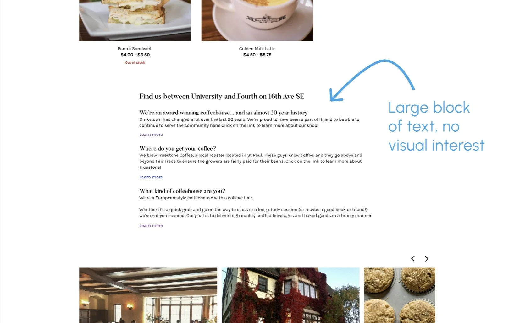
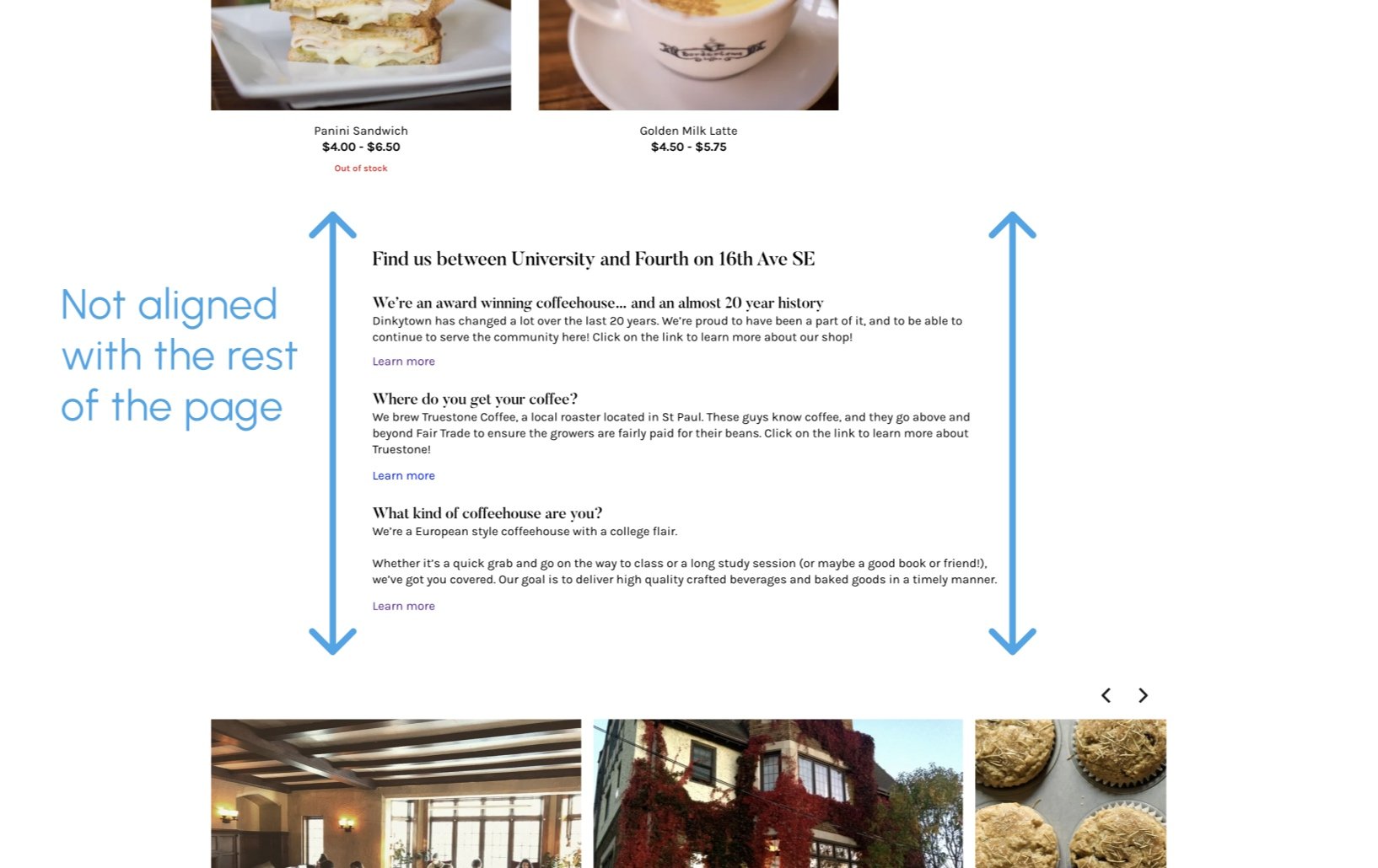
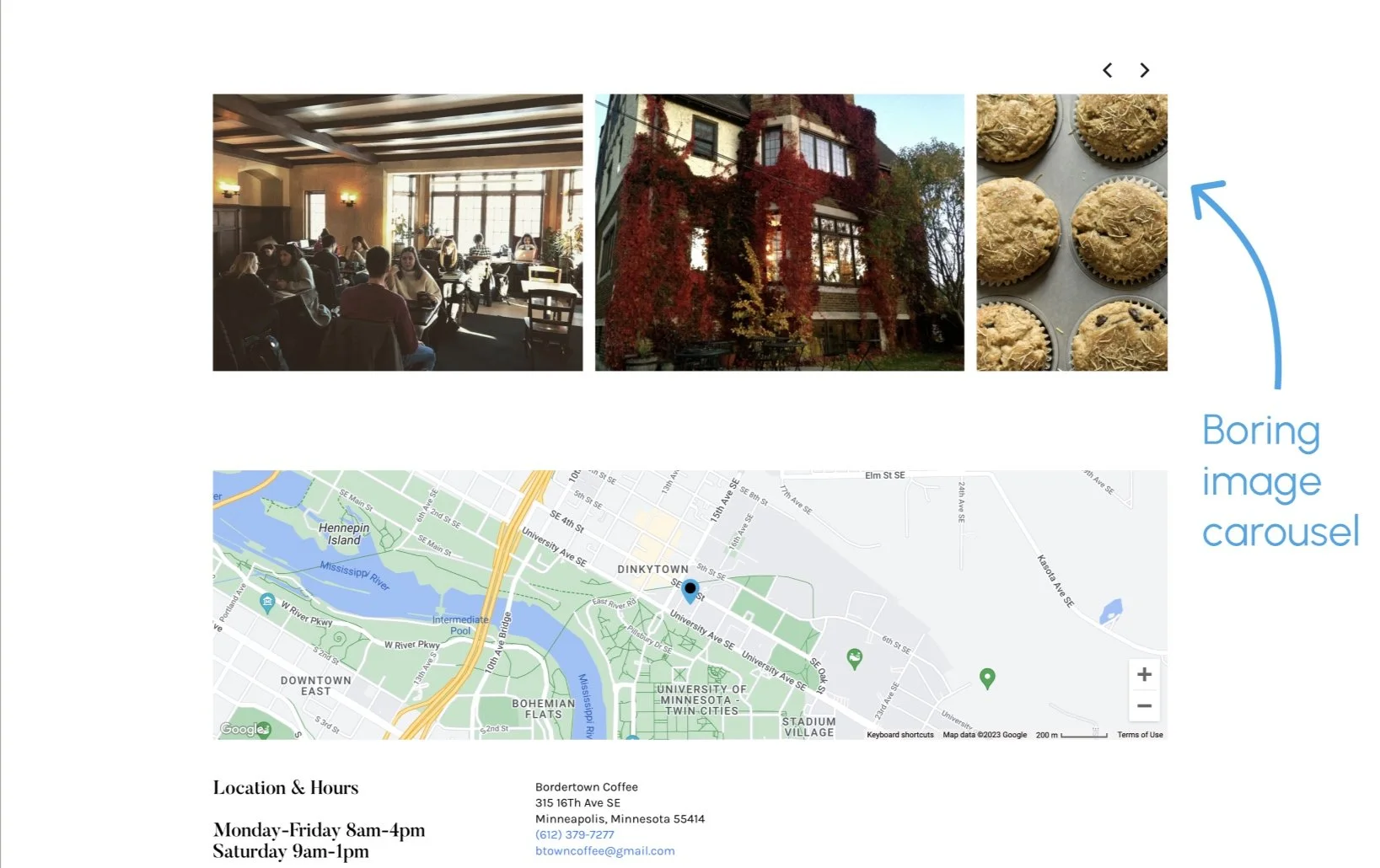
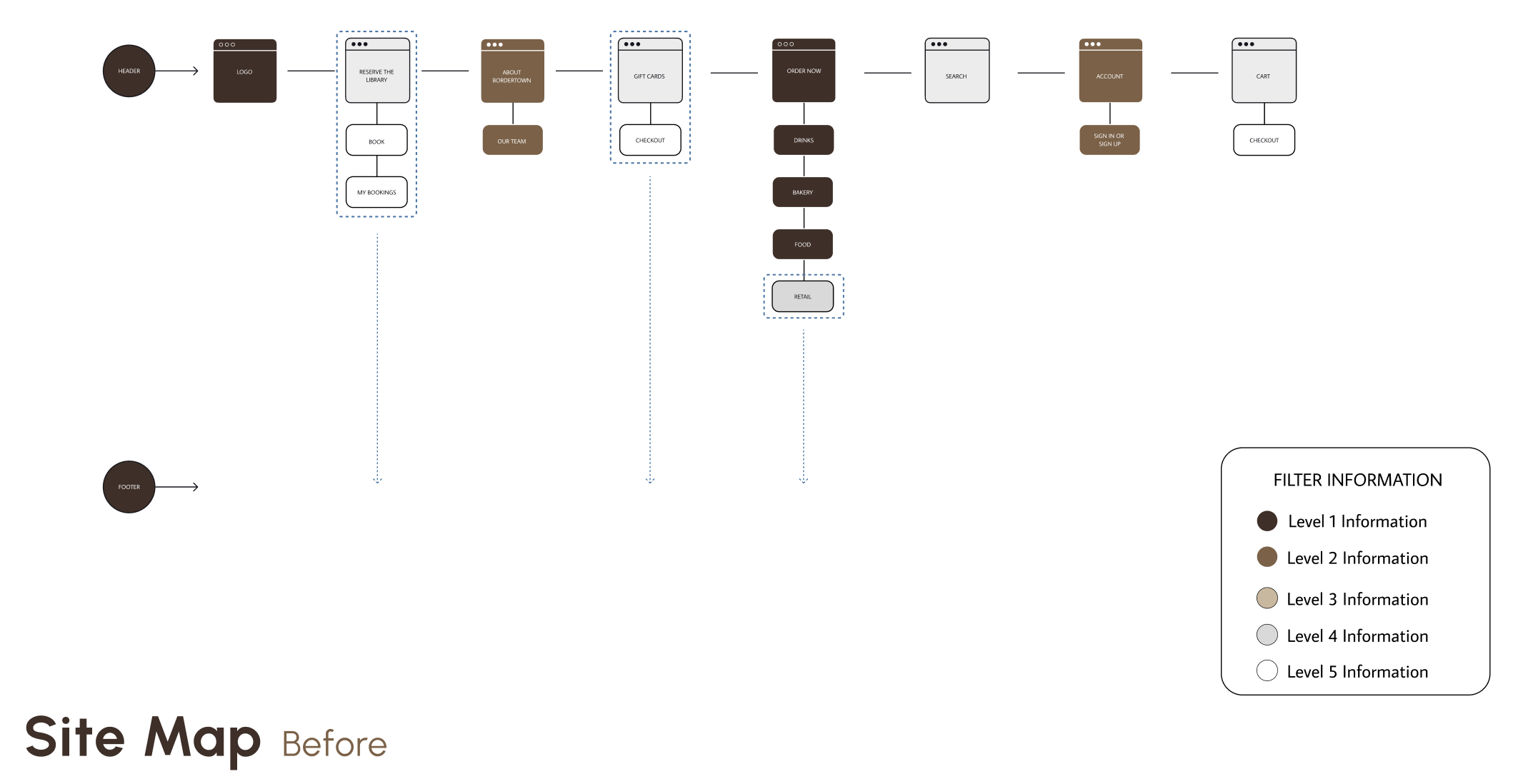
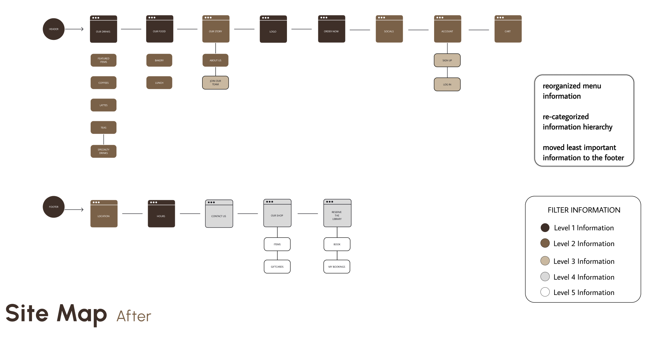
Highlighted below invokes key pain points within Bordertown Coffee’s current homepage.
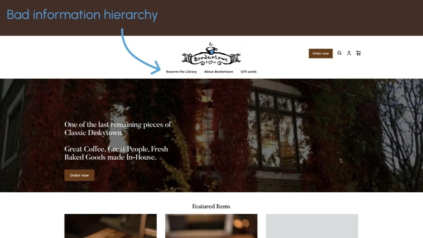
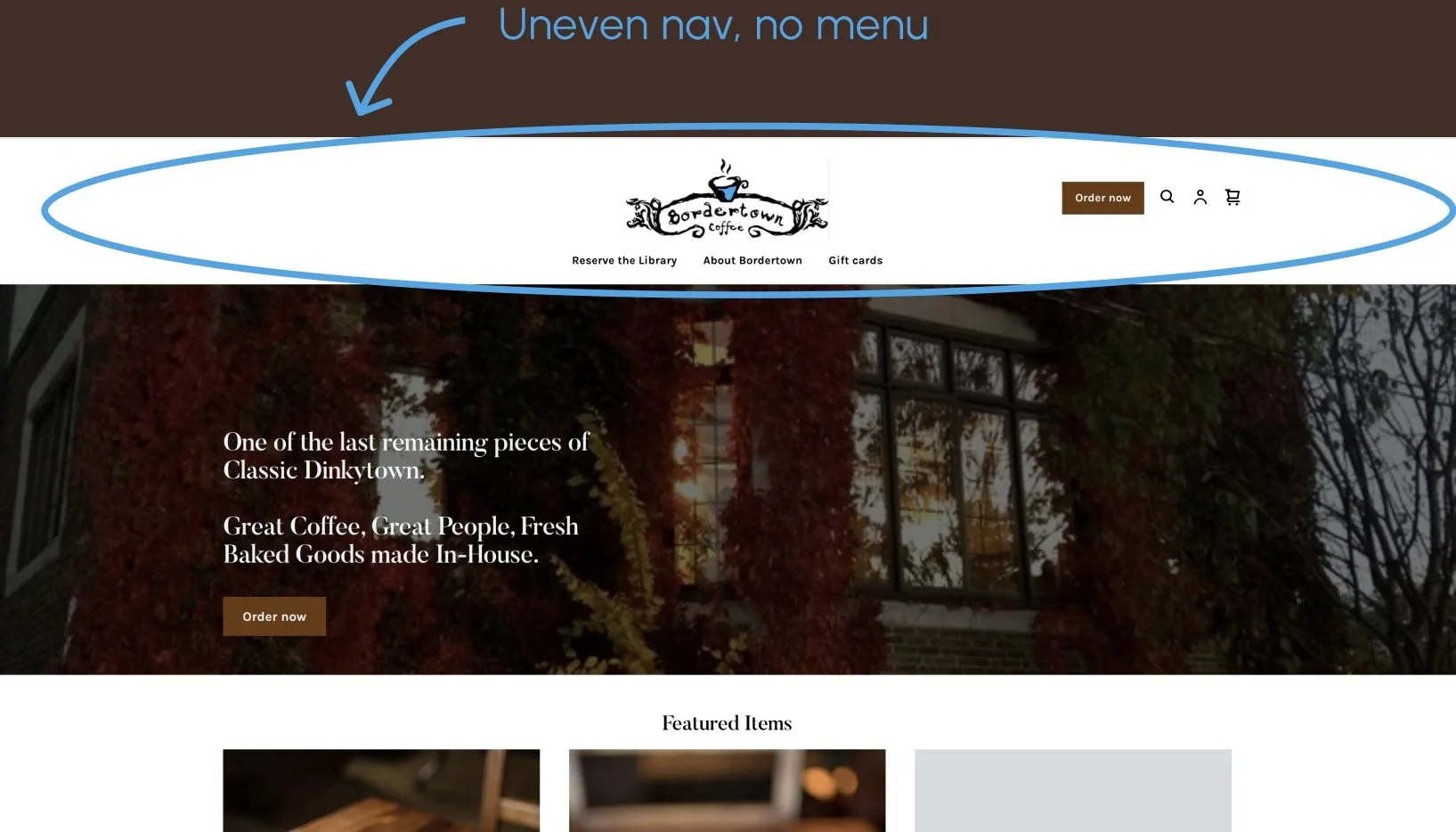
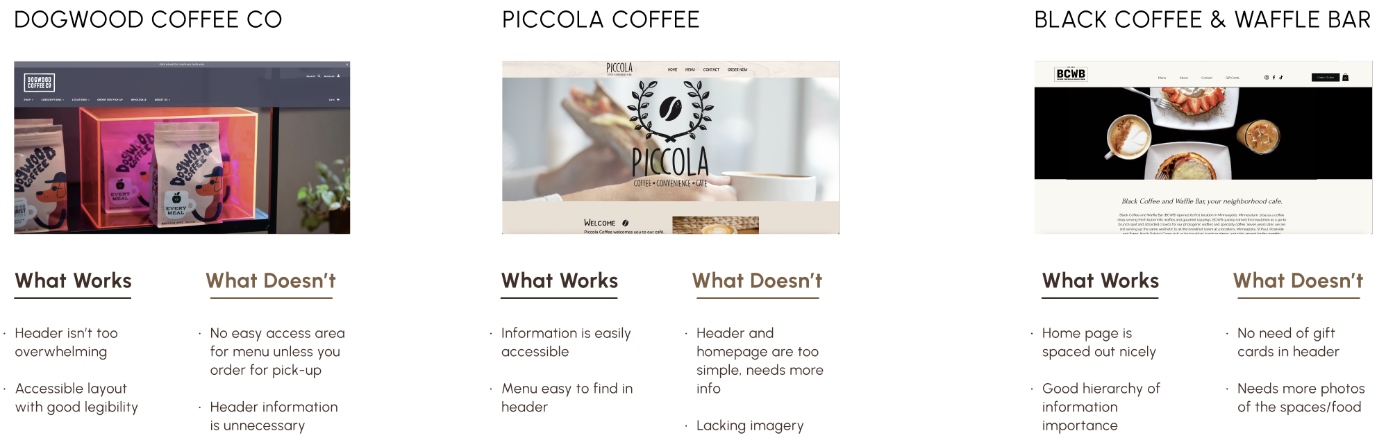
Competitive Analysis
Through examining other coffee related websites, it was noticed that many websites include an easily accessible hierarchy of information, but vary in important and unnecessary header information.
2. IDEATION
Through the ideation process, my team completed an activity to determine what we want our users to know, what we want them to be able to do, and how we want them to feel while browsing the homepage.
Know:
About the company
Products and prices
Location and hours
Pictures
Reviews
Do:
Browse items/reviews
Place orders
Find location
Make an account
Feel:
Satisfied
Excited
Relaxed
Convenience

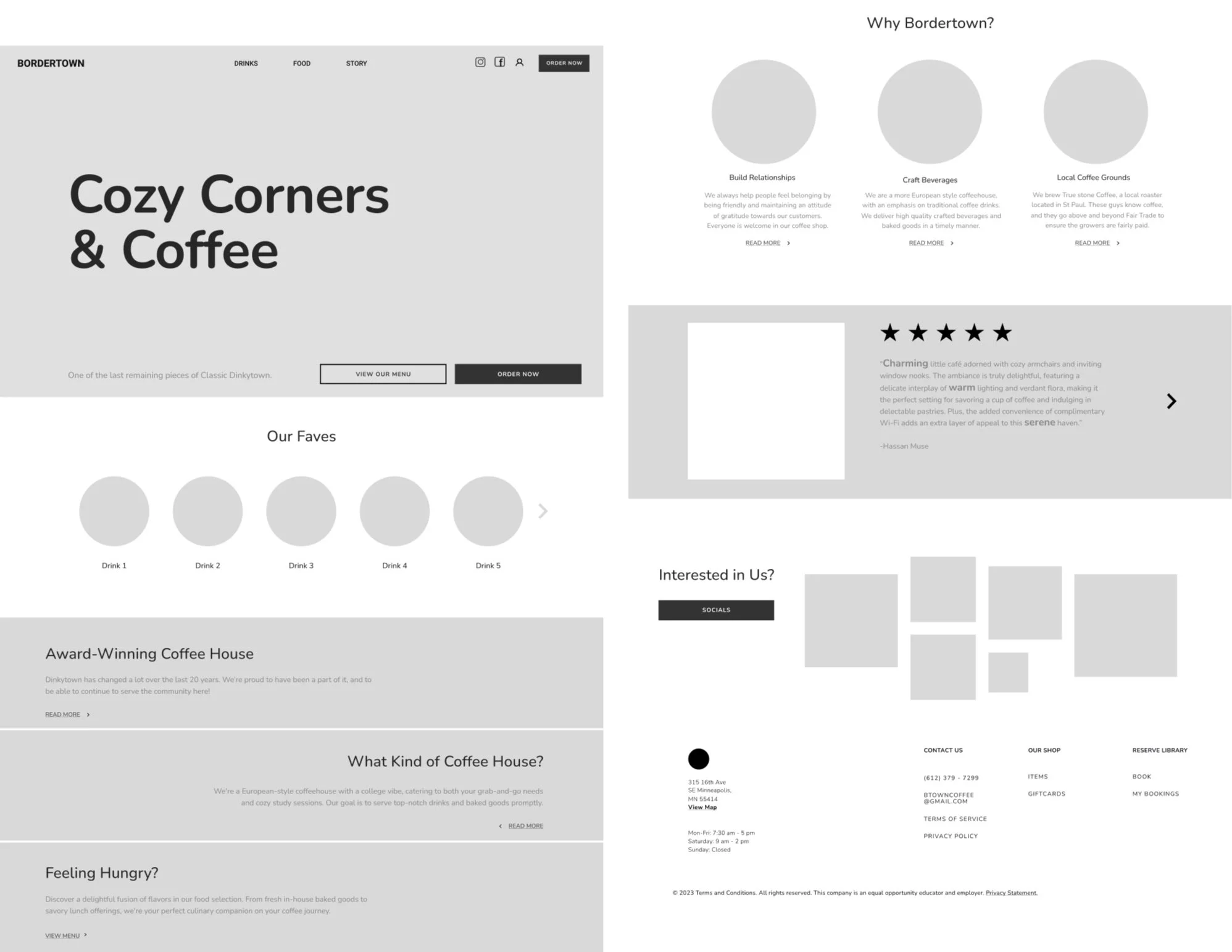
Low-Fidelity Wireframe
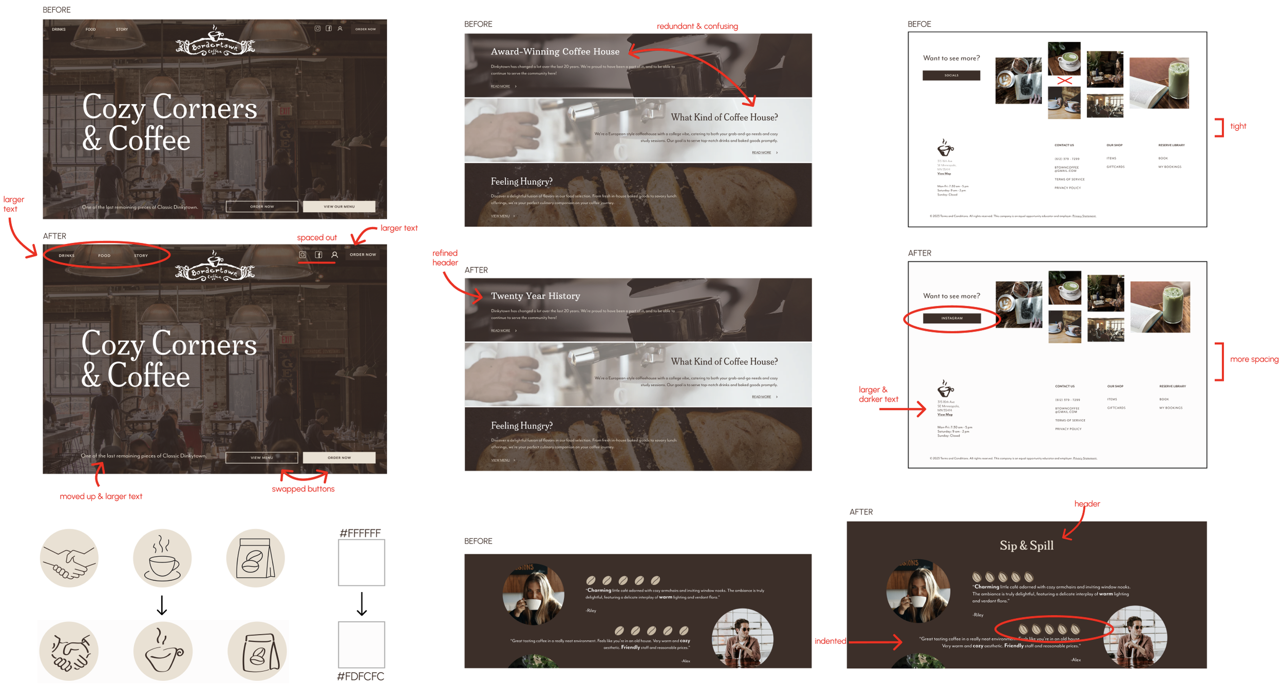
Revisions Based off User Feedback
What Works
Footer is clean
Hero image works well
Love the striped sections
Contrasting color scheme makes it look clean
Coffee bean icons
Bolded words in reviews
What Works
Header options on hero not obvious
Criss cross of the order now and view our menu buttons
Why Bordertown? Section doesn’t match vibe of the rest of the site
Our faves spacing is off
Little more spacing between sections
Larger headers
Text on bottom of hero stands out weirdly/gets lost
Make headline more unique
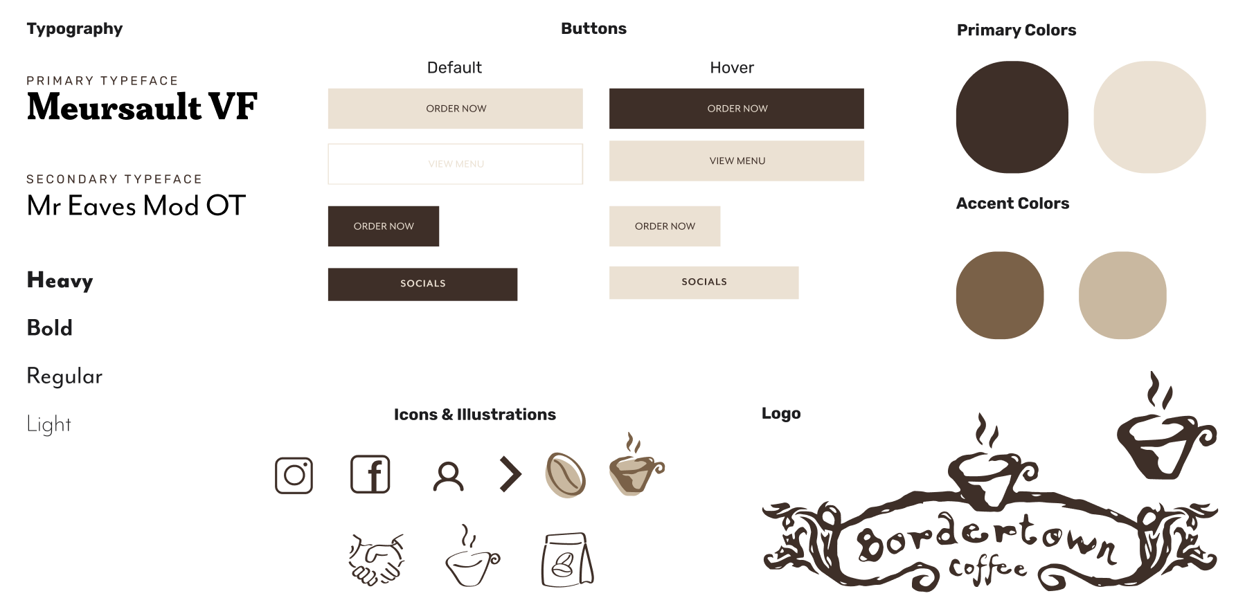
High-Fidelity Wireframe
2. CONCEPT TESTING
User Feedback
Prior to finalizing the redesign of Bordertown Coffee’s homepage, we conducted a usability test with our classmates. We walked them through our high-fidelity wireframe, explaining the reasoning behind the changes and enhancements we made. Their feedback (highlighted to the right) provided valuable insights, which we incorporated to refine the design and ensure a user-friendly experience.
2. WIREFRAMES