DENNIS KIRK’S AFFILIATE PROGRam
overview
Role: UX/UI Designer
Team: Social Media Manager, Marketing
Platform: Web (Affiliate Landing Page)
Timeline: 2 weeks
Goal: Drive affiliate sign-ups and clearly communicate program value
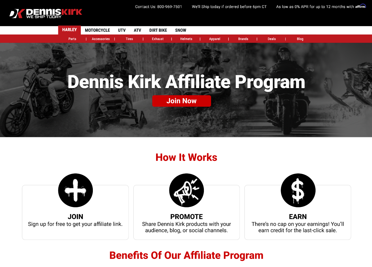
Check out the live landing page: https://www.denniskirk.com/affiliates
the problem
Problem Statement:
Dennis Kirk was launching a new Affiliate Program, but lacked a dedicated experience that clearly explained the program, built trust with creators,and guided users through the Impact sign-up process without friction.
Key Challenges:
No existing affiliate-specific landing page
Users unfamiliar with Impact or affiliate programs
Need to balance brand trust with creator-focused messaging
Minimize confusion and drop-off during sign-up
goals
Primary Goals:
Increase affiliate program sign-ups
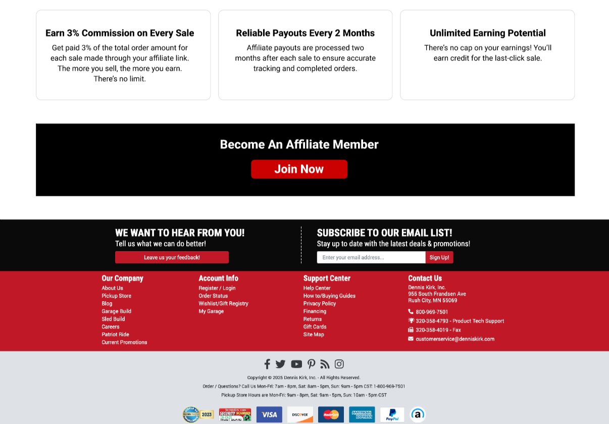
Clearly communicate benefits and commission structure
Guide users seamlessly to Impact registration
UX Success Indicators:
Clear “how it works” comprehension
Strong CTA visibility
Trust-building through brand tone and transparency
target audience
Primary Audience:
Riders
Content creators
Influencers in the powersports space
User Needs:
Quick understanding of “What’s in it for me?”
Simple explanation of how to get started
Confidence that Dennis Kirk is a reputable partner
Clear next steps after applying

Information Architecture, UX/ui Decisions & Strategy
UX Decisions:
Prioritized scannability with short sections and clear headers
Front-loaded benefits to hook creators quickly
Used progressive disclosure to explain Impact only when necessary
Reduced form anxiety by pushing users to Impact instead of embedding a long form
UI Approach:
Aligned with Dennis Kirk’s existing brand system
Bold, high-contrast CTAs for conversion
Clean layout to feel trustworthy and professional
Visual rhythm that supports long-form scrolling