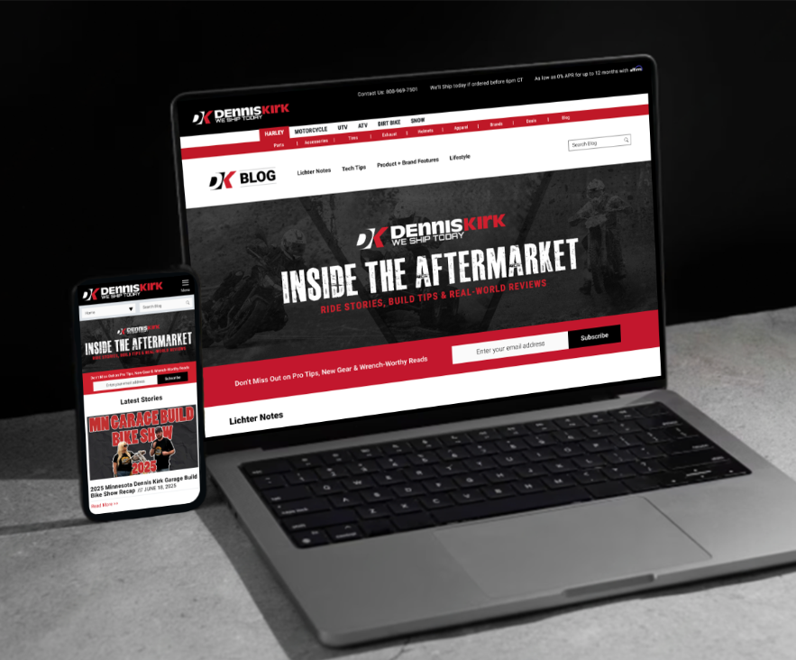
DENNIS KIRK’S blog
overview
Role: UX/UI Designer
Team: Third-Party front end developer, Marketing
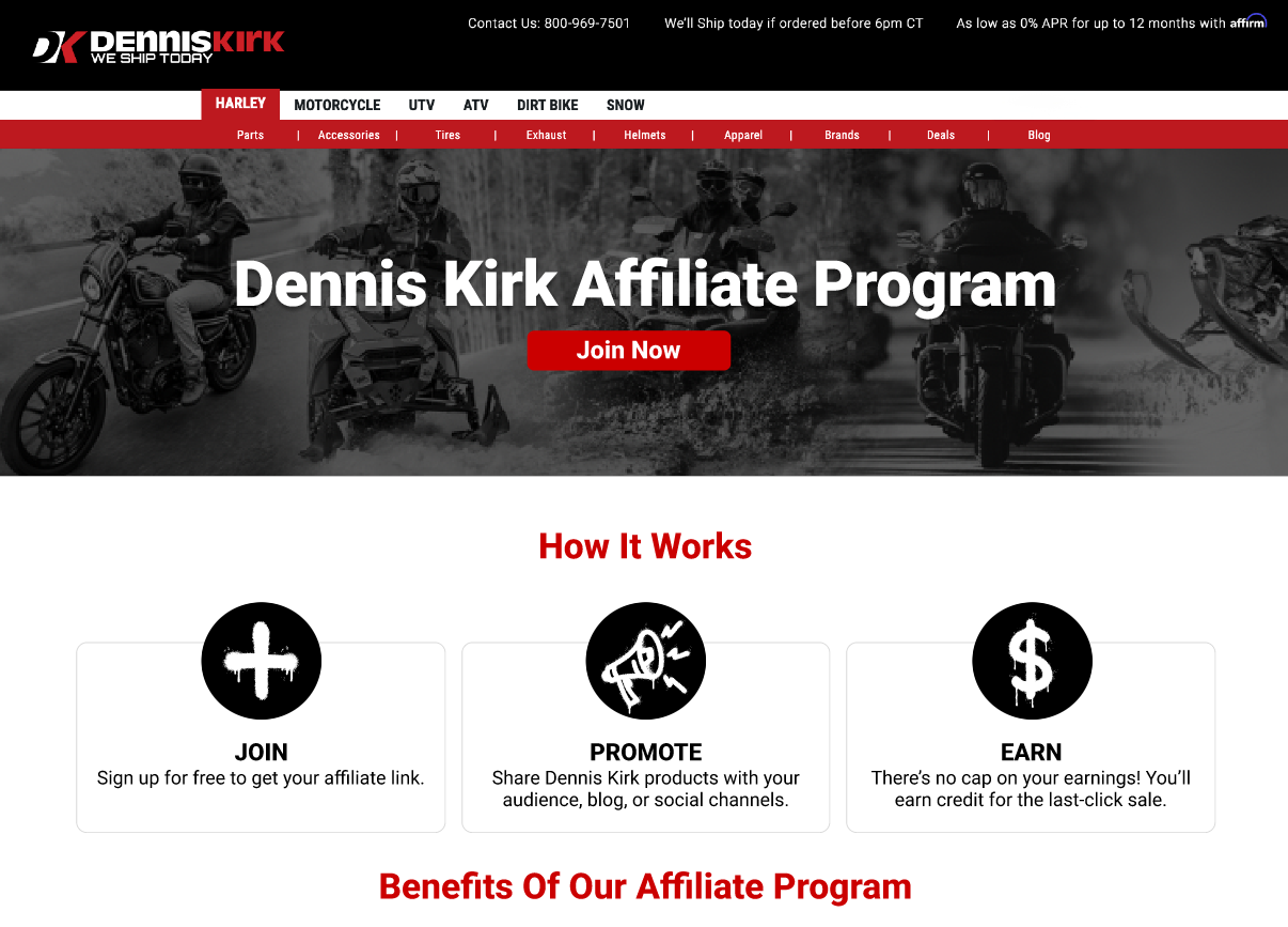
Platform: Web (Affiliate Landing Page)
Timeline: 8 weeks
Goal: Redesign the Dennis Kirk blog to create a more accessible, efficient, and modern user experience that better serves powersports enthusiasts while aligning with the brand’s evolving digital presence.
Check out the live landing page: https://www.denniskirk.com/blog/
the problem
Problem Statement:
The blog design had not evolved alongside the broader Dennis Kirk brand. Its visual presentation, navigation structure, and accessibility standards no longer aligned with modern UX best practices, creating an opportunity to improve clarity, consistency, and overall user experience.
Key Challenges:
The layout felt visually dated and inconsistent with the current brand.
Navigation made it difficult for users to quickly find relevant content.
Content hierarchy lacked clarity, reducing scannability.
Accessibility best practices were not fully implemented.
The overall experience did not reflect the quality and authority of the Dennis Kirk brand
goals
Primary Goals:
Improve usability through simplified navigation and clearer content hierarchy
Modernize the visual design to better reflect current brand standards
Increase accessibility and mobile responsiveness across devices
UX Success Indicators:
Clear, scannable content structure that supports fast information discovery
Strong visual consistency and improved readability across breakpoints
Reduced friction in navigation and a seamless cross-device experience
target audience
Primary Audience:
Motorcycle and powersports enthusiasts
New or first-time riders researching gear and safety
Shoppers comparing products before purchase
Existing customers seeking ongoing support and expertise
User Needs:
Quick, scannable information
Reliable, expert-backed content
Easy content discovery
Mobile-friendly experience
Clear path to action

MARKET RESEARCH
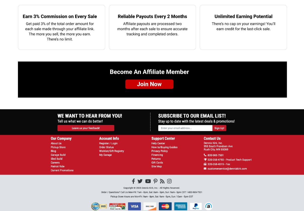
UX Decisions:
Prioritized scannability with short sections and clear headers
Front-loaded benefits to hook creators quickly
Used progressive disclosure to explain Impact only when necessary
Reduced form anxiety by pushing users to Impact instead of embedding a long form
UI Approach:
Aligned with Dennis Kirk’s existing brand system
Bold, high-contrast CTAs for conversion
Clean layout to feel trustworthy and professional
Visual rhythm that supports long-form scrolling